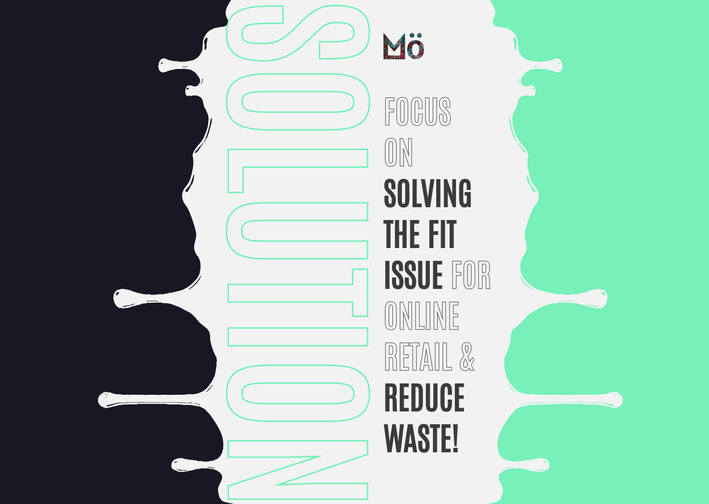
Have you ever bought clothing online that doesn’t fit?
The average rate of returns is about 21%
which equates to $761 billion dollar dilemma*
due to lack of a standardized size system. **
“The elephant in the room” need to be tackled.
*A more than $761 billion dilemma: Retailers’ returns jump as online sales grow
**The Key Problem with Online Clothes Shopping
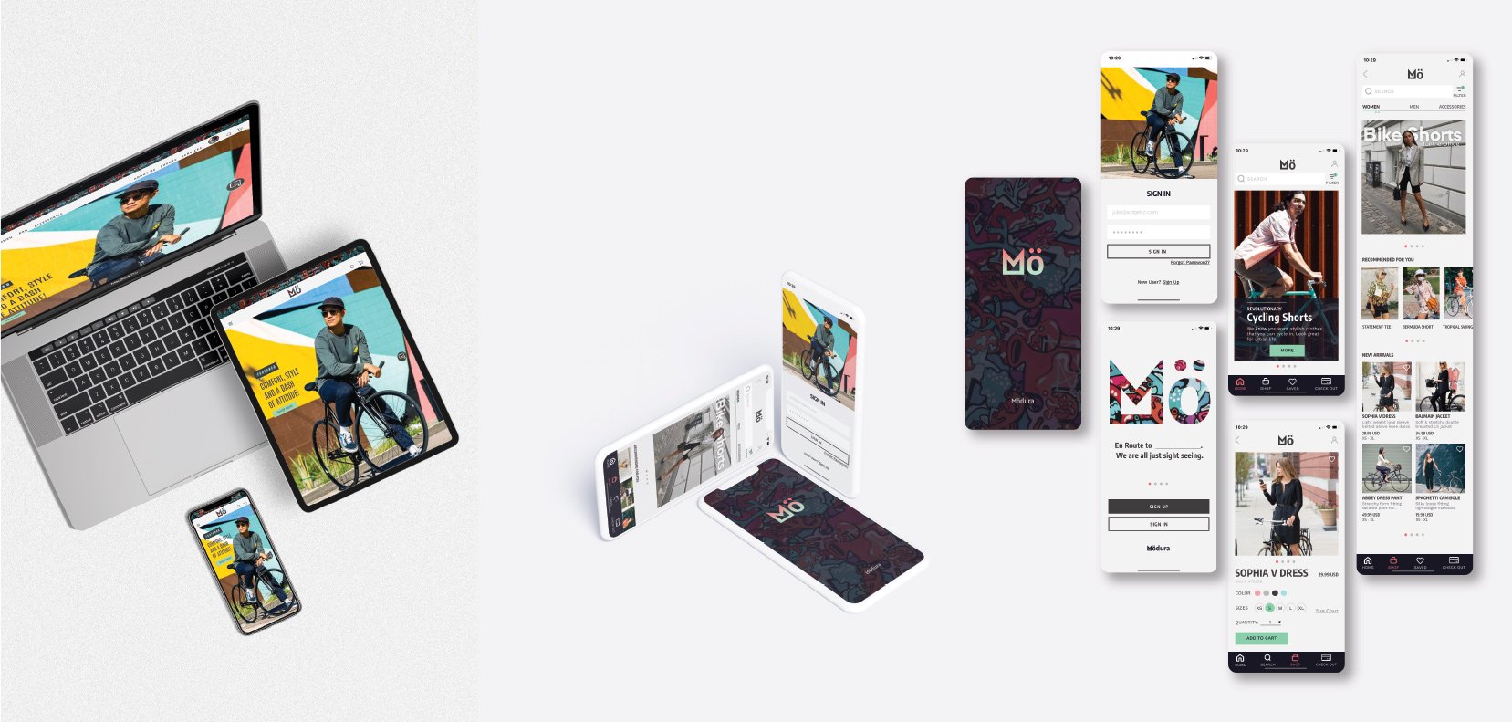
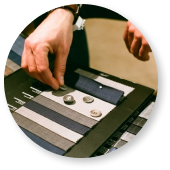
Mö Cycling Apparel
E-comm Website & App
“It takes a village!” To all my SME, users, developers for this project, friends & family, especially strangers– your valuable insights give life to my project.
THANK YOU!
My Role: UX & UI / Branding / Website & App
My role in the project was to design Mö Cycling Apparel’s branding, E-comm website and App by undertake user research, perform market analysis, synthesis information, construct information architecture, define project scope, setup responsive E-comm website, run user testing, utilize priority matrix, iterate and reiterate to achieve a smooth, engaging and enjoyable user experience for online users.
Duration: 4 weeks
Tools Used:
Design / Prototype: Figma, Photoshop, Illustrator
Analysis Miro, Optimal Sort, Maze
The process
The process is never a linear one in any creative project.

Overview

Research & Define

Design
Testing & Iterate

Overview
About Mö

Active Comfort
Mö (pronounced “MEU”) is a lifestyle cycling apparel company that supports folks on the go!
Mö is excited to revamp its branding and explore the online retailing arena. Mö is committed to providing a pleasant and seamless experience for our digital users, despite industry challenges surrounding absence of standardized fit and building customer loyalty.
Contemporary
Smart Casual
Cycling En route
Urban Flair
Sustainability

Understand & Empathize
The two sides to a coin.

E-COMM Retail Business
• Fierce online retail competition.
• Disconnect in translation-fit, color, touch & feel of materials.
• How do we stand out among other competitors?
• How can we attract and build trust with new consumers?
• How do we establish brand loyalty?

Consumers
• Option paralysis from consumers.
• How will I know if the size fits me?
• Is the brand and product sustainable?
• What value will this new brand add to my life?
• Will I get superior customer service?

Research &
Define
Comprehensive Research (SME, Key User, Secondary)
Understand Key Users / Demographic
Define Shared Goals
Define Main Focus
Define Scope
Comprehensive Research
I was able to cast a wide net and tap into SMEs from different discipline, interest groups to help me see the problem from multiple perspectives. This enable me to collect and synthesis from a rich array of essential information paramount to this project.
For the initial research & interview I worked with:

-
What are the main business needs, goals and objectives?
What are the challenges?
Where are the opportunities worth exploring?
Are there hidden assets worth marketing?
Any new technology worth exploring, and accessing their value for the project?
Why isn’t there size standardization?
Synthesize research to location pain points.
-
Understand pain points, and challenges that turn consumers off.
What gets them excited?
What features would they like to see and find useful?
What needs to happen for engagement?
-
How do competitors address these problems?
Retailers’ pain points and opportunities.
-
Articles and videos about the fashion E-comm industry.
Synthesization process:
Full PDF presentation available upon request.
From left to right: Competitive Analysis, Secondary Research, User Research, SME Research, Empathy Map & Persona.
Research done with fashion industry experts to cycling apparel e-comm retailer; from competitive analysis to secondary research, from Key users to general public.
User Research: Who are the HENRYs?
According to Investopedia.com HENRYs (The High Earners, Not Rich Yet) is “is a term to describe people who earn high incomes, usually between $250,000 to $500,000, but have not saved or invested enough to be considered rich. Most of HENRYs' incomes are consumed by consumer spending, educational costs, and housing.” Through my research, I have decided to include the 100K -250K income range as well.
Key Findings of HENRYs

Savvy
The HENRYs are more savvy than your average consumer. Tools such as comparing products, pricing and reviews are all at the touch of their fingertips.

Busy
The HENRYs appreciate products that fit their busy lifestyles. They pay attention to detail and product that offers a smooth user experience..
Customization
The HENRYs crave customization that give them an edge and align with their individualism. They appreciate being seen, heard and catered.
Details of HENRYs

Hipster HENRY 22-50 (He/him)
Creative or Tech field
Athletic
Commute to work
Busy lifestyle
Surfs Facebook & IG
Respond to email deals
Savvy Comparison shops Google, Amazon, YouTube reviews

Trendy HENRY 22-50 (She/Her)
Working professional
Self care is important
Carves out fitness sessions such as yoga, pilates & gym in their busy schedule
Social Facebook/IG/TikTok
Comparison shops, yet gives in to special treats and impulse buys
Subscribes to & reads Blogs

Neutral HENRY 22-50 (NB)
Gender neutral
Always on the lookout for fashion and trends that does not box them in traditional categoryWilling to try new brands
Identify with aesthetics and stories that resonate with their own.Cares about the environment and wouldn’t mind spending more and buy less.

Pro HENRY 17-45 (All)
Huge cycling fans.
Semi pro to pro cyclists that competes in local and corporate level race.
Belong to teams that have sponsorship from corporations
Wears custom made kits
Define Shared Goals
How might we engage users to purchase with confidence and ease?

SCOPE
-
1- The Right Fit
Fit and replicating in-person experience has been the key challenge in the online retail sector.
Due to non-standardized sizing and grading systems, online retailers can address issues ranging from measuring guide, size chart to questionnaires.
***
Smart Sizing
3D Fit
-
2- Engaging Product
Delightful UI, smooth UX and personalized services are necessary to satisfy maturing E-comm market.
Engaging users takes more than the MVP of displaying the product and adding to cart, engagement on the service side builds trust.
***
Fixed Chat Button
Quick Add Function For Products
Book A Personal Shopper
-
3- Utilizing Technology
New technology such as VR and AR can replicate some in person shopping experience.
AI / Big Data can be utilized to formulate curated selections catering to the users taste and preferences.
***
Subscribe to Bespoke List
3D Pro Fit
Tailored Sub Menu Page

Design
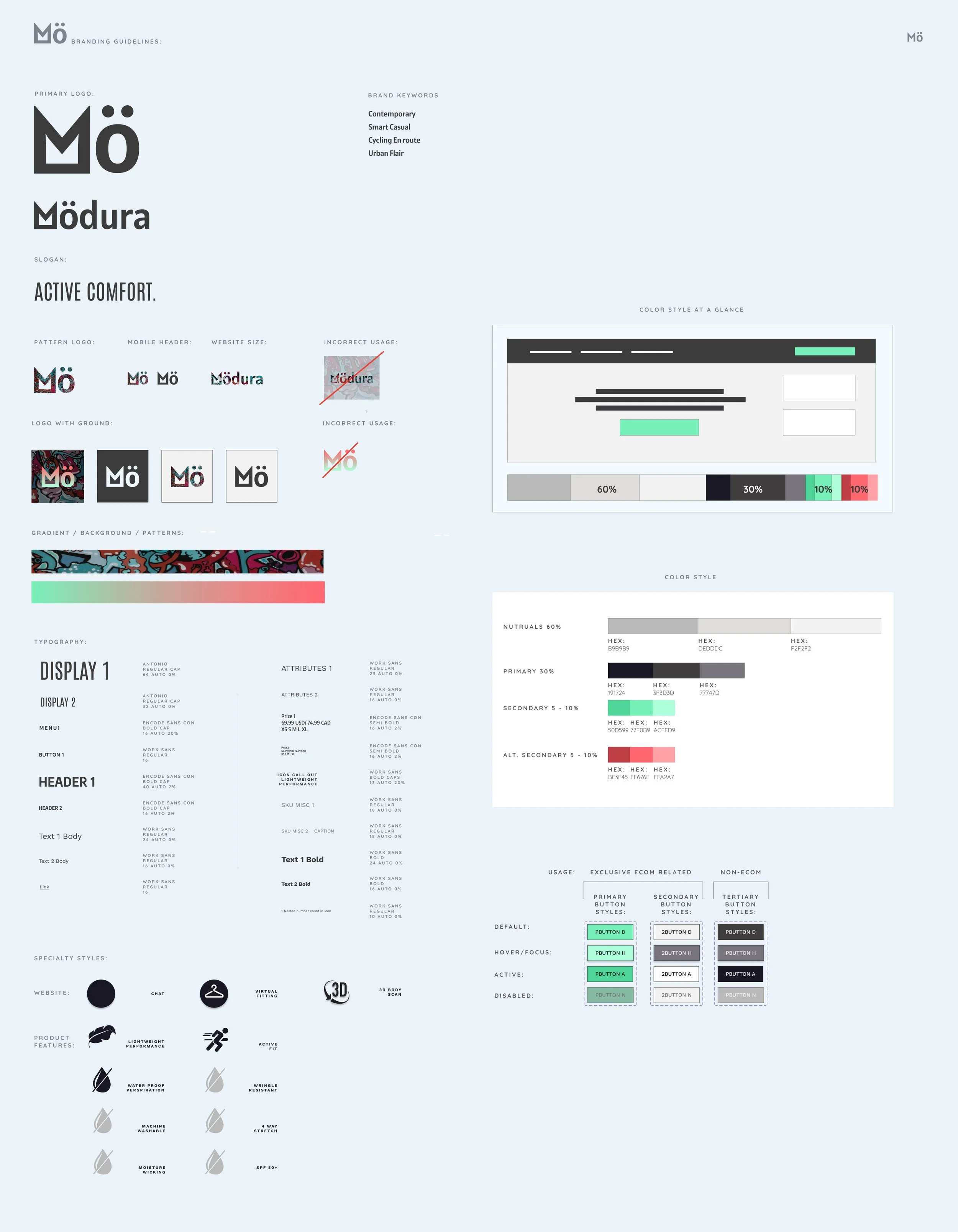
Branding / Style Kit / UI Kit
Information Architecture
Responsive Wireframe / High Fidelity
Prototype 5 Different Flows


Primary Logo
Design is rarely a linear process. This final logo was not conceived at the sketch stage but emerged during the digitization stage.
Typography
To achieve harmony, convey personality, fresh contemporary look, and display style was a challenge for an E-comm product. It calls for a whole new level of complexity in delineating hierarchical levels in typeface, weight, readability and practicality. This process took a lot of “playing around.” It pays off in dividends when it’s done right.

Style Tile
The style tile is a living document.
While I try to anticipate every possible scenario, there will always be deviations, revisions as well as additions.
When iterations end so does the brand.
UI Kit
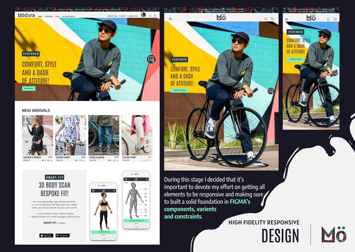
Ensures all elements utilize components, variants and constraints, accommodates responsive design and streamlines iteration process.

UI Details
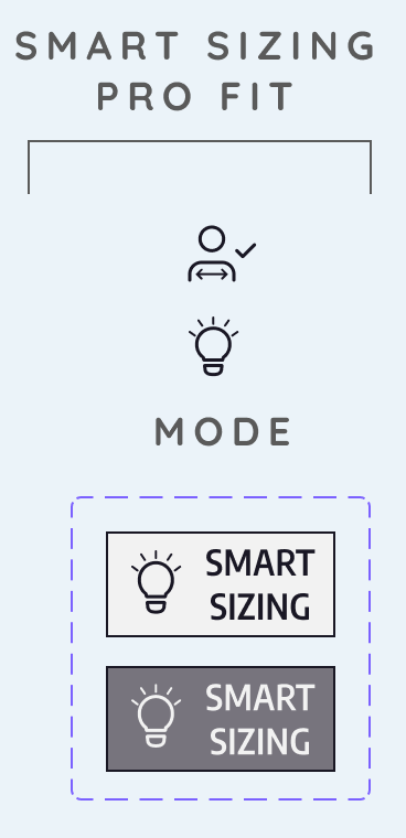
Smart Sizing Icon variables

Navigation Variables

Extras Styles that give the product its personality
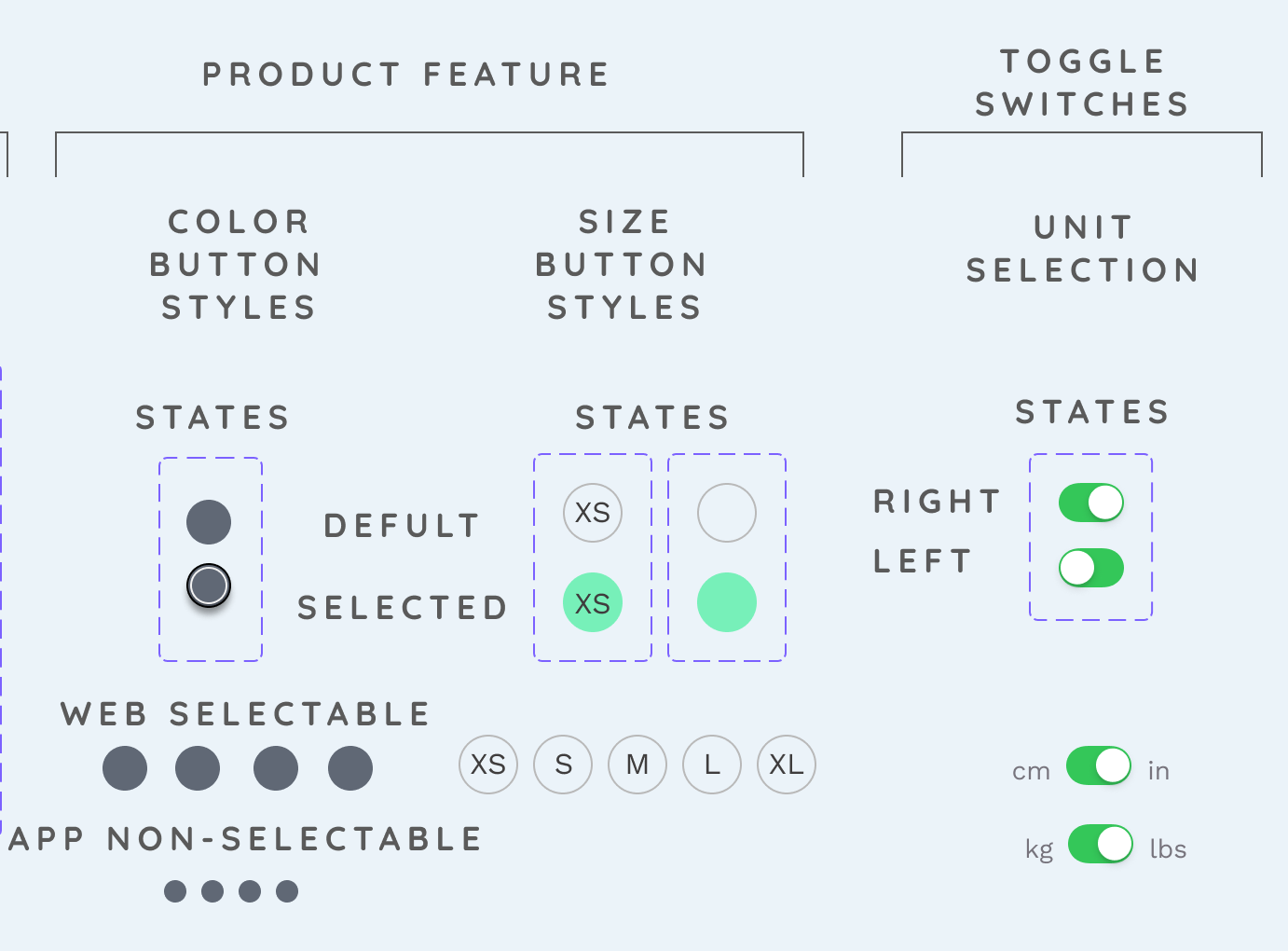
Toggle switches

Button States
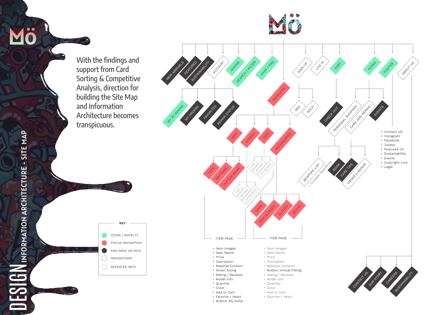
Information Architecture
Card Sorting
Site Map
User Flow
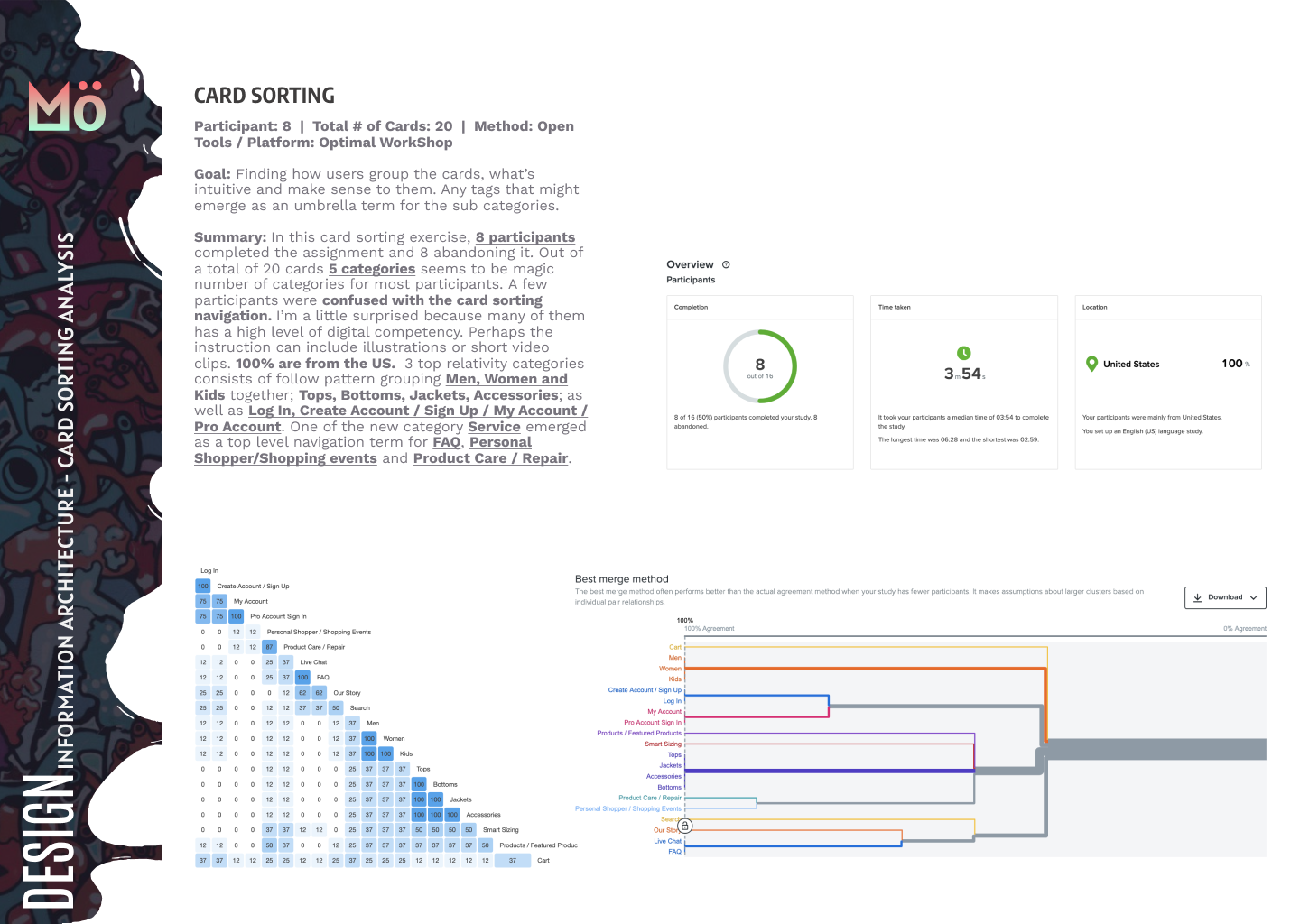
Participant: 8
Number of Cards: 20
Method: Open
Tools: Optimal WorkShop
Goal: Finding how users group the cards, what’s intuitive and make sense to them. Any tags that might emerge as an umbrella term for the sub categories.

Responsive UI Design
Responsive Wireframe
Responsive High Fidelity
Screen Capture of High Fidelity Responsive Behavior
Screen capture of responsive behavior
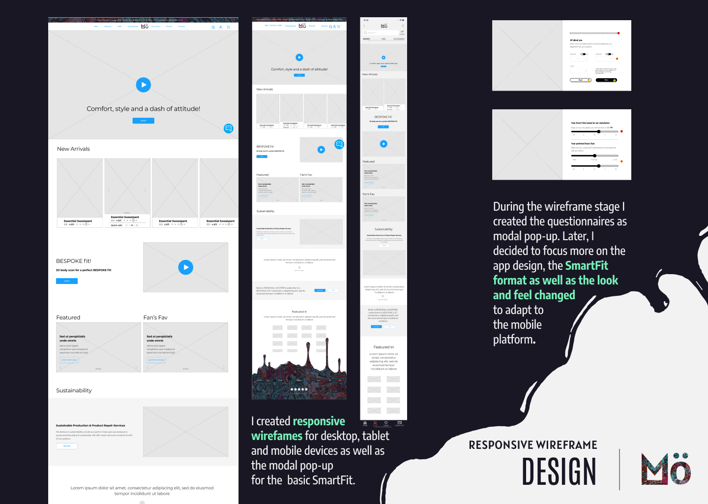
Responsive Wireframe
Responsive High Fidelity
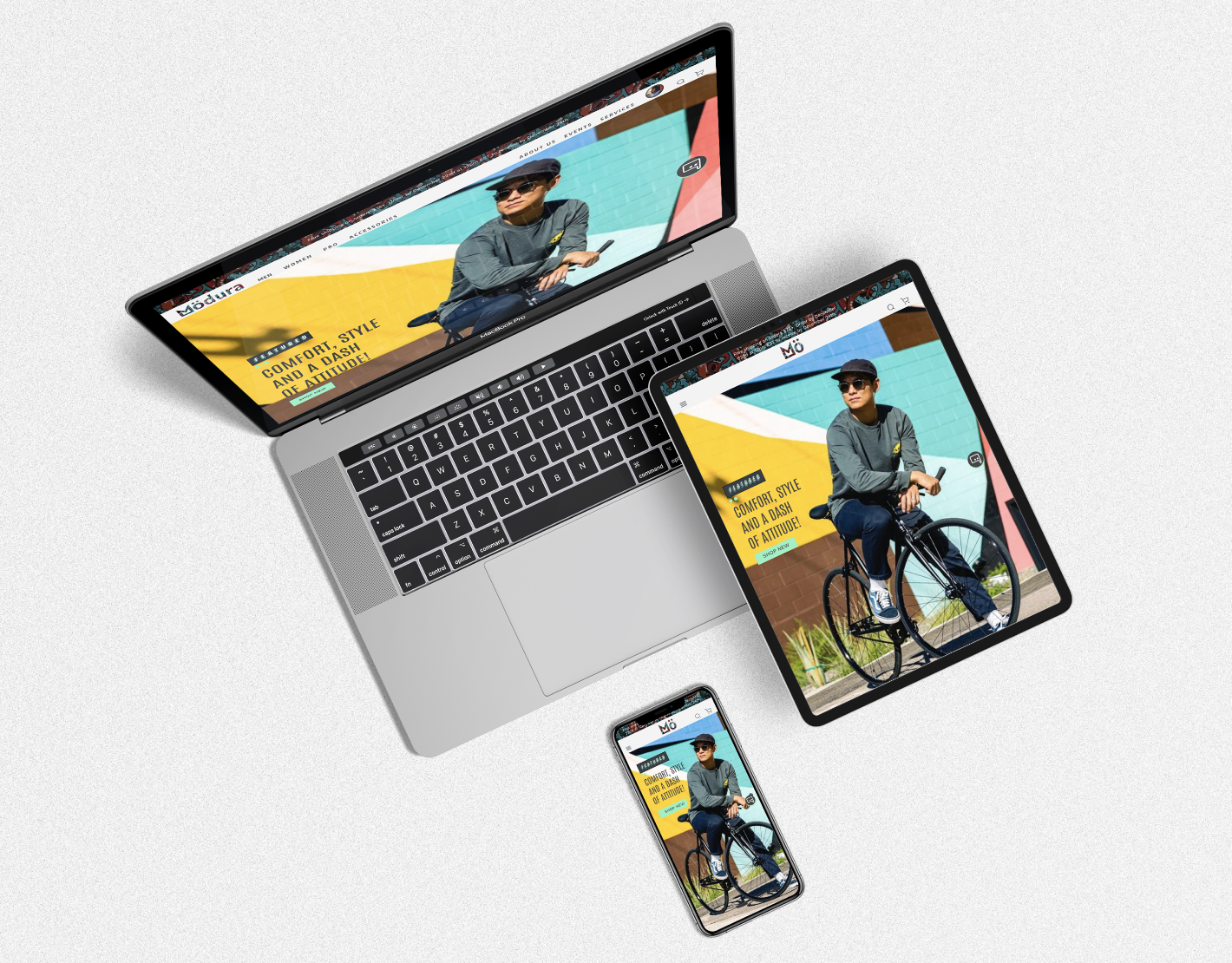
E-comm Website Homepage
FEATURES
Tailored Sub Menus
Quick Add
Join Bespoke List
Book a Personal Shopper
Lifetime Repair Service (Call Out)
Chat Button (Call Out)
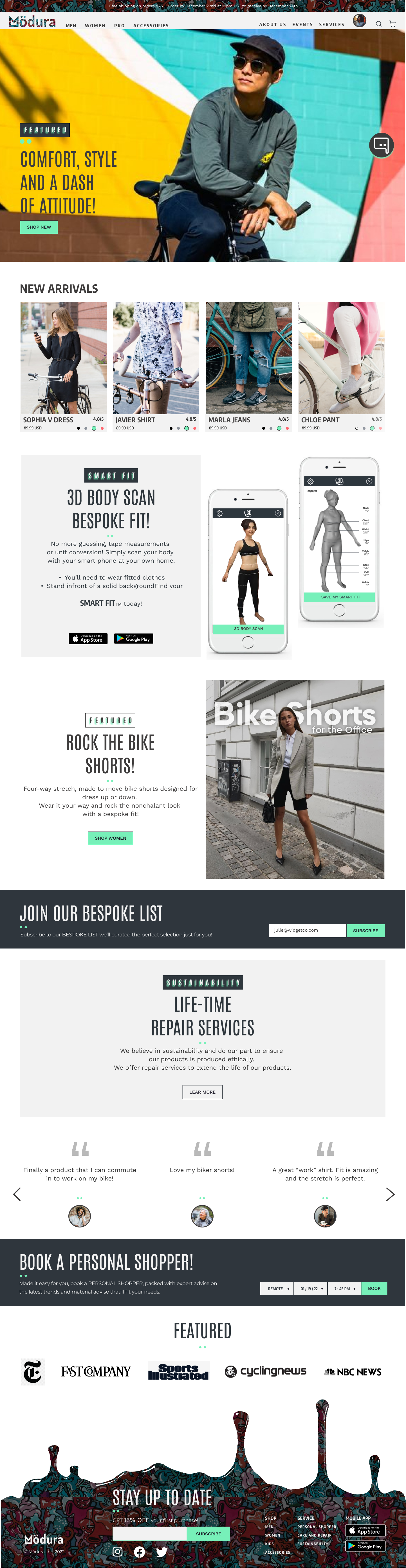
Tailored Sub Menus

Well organized and tailored submenus feel more inviting, can be used for marketing.
Quick Add
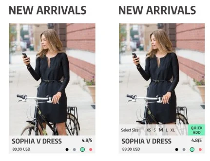
Rollover Quick Add, for busy users, enables quick additions to cart then compare and narrow down the selections later.
Bespoke List

Bespoke List utilizes data intelligence and algorithm to formulate curated list of styles specific to each user.
Book Personal Shopper
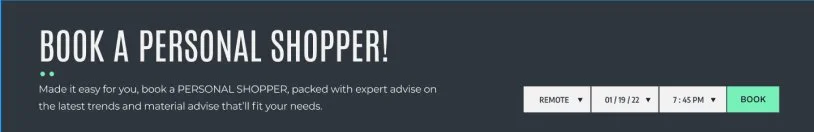
Users can book a personal shopper on the homepage!
App Design
FEATURES
Add to Cart
Animation Sequence
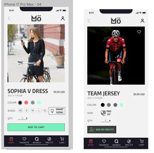
Smart Sizing
3D ProFit
Add to cart

Add to cart feature
App Opening Animation

I added a splash screen increasing user delight.
Smart Sizing

Smart Sizing MVP: A holistic approach to research informed my decisions on prioritizing SmartSizing. Although size charts are still widely used, by competitors, research indicates users find it unreliable. Users say relying on reviews helps but time consuming. Smart Sizing streamlines decision making process, users no longer have to rely on reviews for the perfect fit.
3D ProFit

Part of the cycling retail business I researched builds cycling kits for pro cycling teams. This 3D body scan elevates customization services.
User Testing &
Iteration
Comprehensive User Testing
Categorizing Findings
Priority Matrix
User Testing
Iterations
Comprehensive User Testing
Moderated & observed user testing revealed these patterns:
Tapping top left corner for a back button
Top right corner for an exit button.
Hesitancy to reveal age.
Unmoderated, remote testing using MazeDid not yield deep insights.
At this stage it’s best to learn the pains and gains of usability through moderated testing.
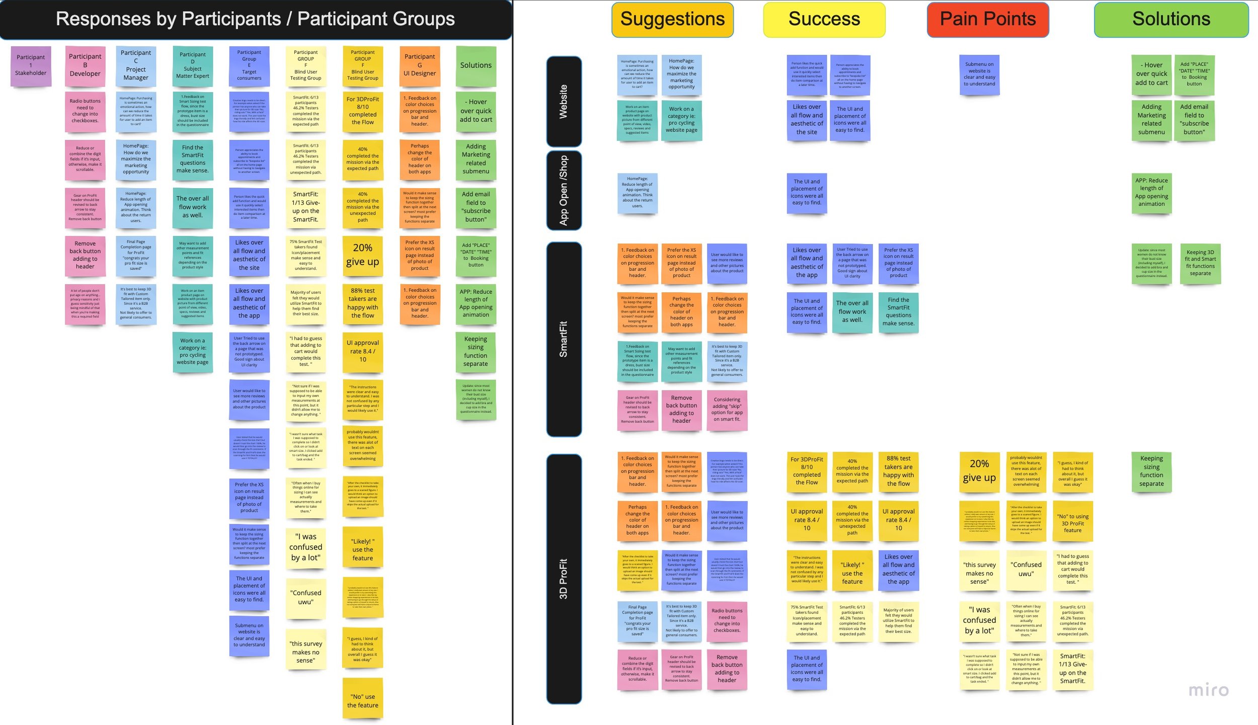
Affinity Map
Sorting out the findings in four categories- Homepage, App, SmartFit and ProFit under 4 areas of Suggestions, Successes, Pain and Solutions.
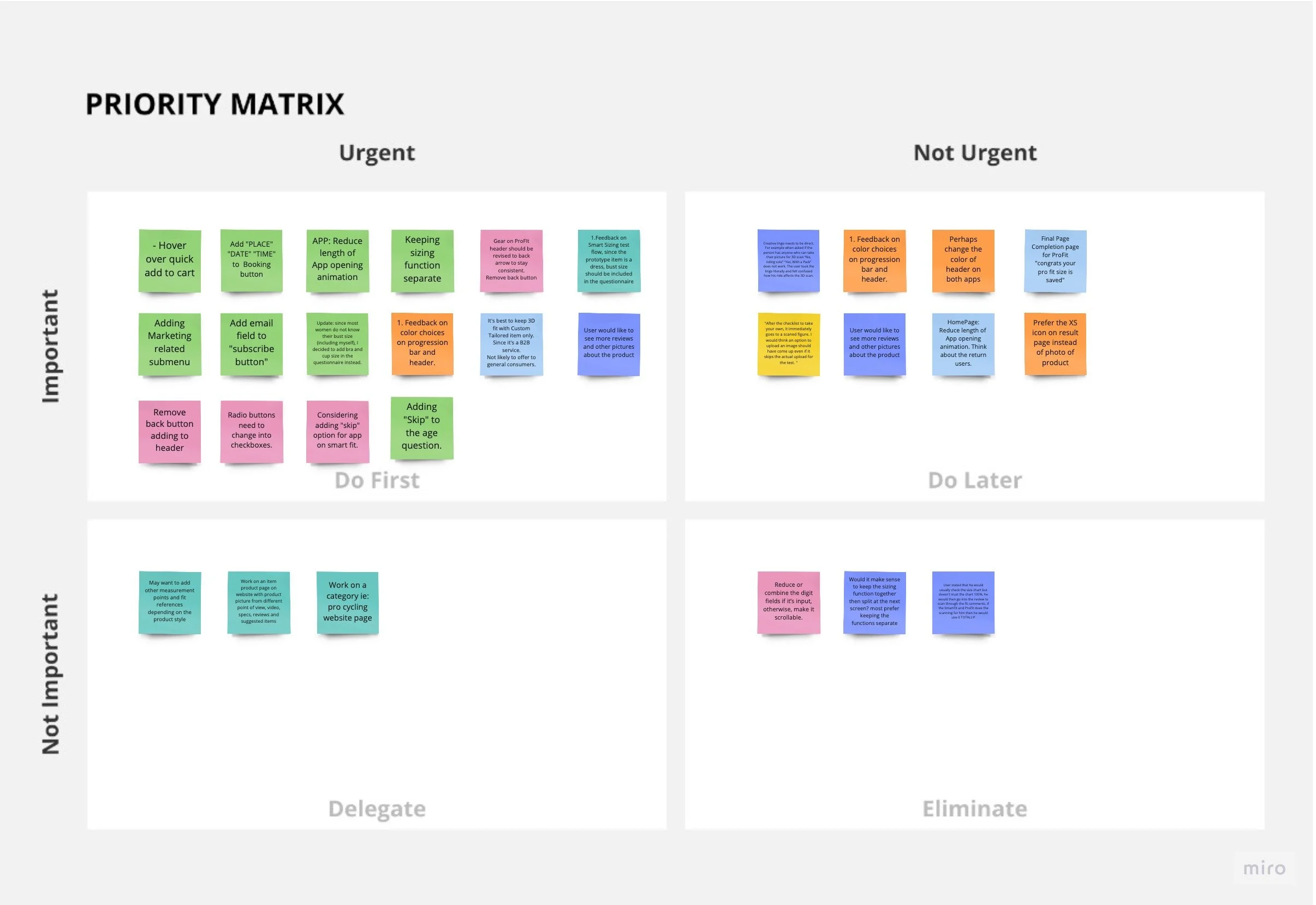
Priority Matrix
Priority Matrix Sorting is great for sorting out what to do First, do Later, what can be Delegated and Eliminated.
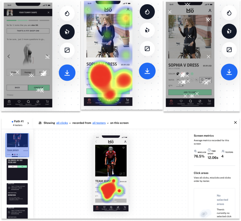
Unmoderated
User Testing
Although unmoderated user testing were at times confusing for users and in general did not offer as much insight compared to moderated interviews. However, there are definitely interesting findings such as heat map and click map that showed where user interaction took place. They were exactly where I would like them to. If the product is fully built out then the interactions would be interactable. These heat and click maps help validate the UI and UX design.
It’s also good to know the time spent (how long users took) for each flow, since the goal is steamline the flows for busy users.
Iteration- Information Architecture
Various information architecture route had been considered, prototyped, tested, & iterated.

OPTION ONE: Group “Smart Sizing” and “3D Scan” under “Check Fit”. After speaking with SME and key users, it doesn’t make sense to lump them into one, because why would anyone pay extra for a style that is commercially available to everyone else?
These iterations were made based on E-comm retailer inputs, user testing, communication with developers, and a splash of logic reasoning.
OPTION TWO: Keep the two functions separate for different type of products was the final direction. “3D Fit Pro” is an exclusive service and justifiable by the premium price tag.
Iteration - Information, Verbiage, UI
Countless iterations took place for this project almost on a daily basis.
These iterations were made based on inputs and suggestions from SME in fashion, software developer, users and other UX/UI designers.
Suggestions from SME:
Missing measurements
Feedback from developer:
Adding back button and exit button.
From Users
Verbiage revisions
Revisions to information architecture.

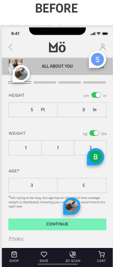
During one of my SME interviews with a fashion expert, the bust size was suggested as a crucial measurement, however, since most people don’t know their bust size, I’d introduced the field to “Bra Size” instead.
“Skip” option is also implemented to make the Age field non-mandatory.
During A/B testing the size result was favored over the page with enlarged product.

Iteration - Verbiage, UI
Last screen of 3D Pro Fit sequence, UI design was at first confusing. During observed user testing, users mistakenly tapped “Add My Pro Fit” button for a functional button. To problem solve, I put the button in a circle and noticed a significant drop in user mistaken it for a functional button.
Iteration - Streamline the Services
Simple interactions and smooth experiences are important to the user.


There is no need to navigate to another page to “Book A Personal Shopper” and “Join Our Bespoke List” when it can be done right on the homepage. These revisions were made to streamline the process.

E-comm Website
App Add to Cart
App Opening Page Animation
Smart Sizing
3D Pro Fit
With more time,
I want explore…
Chat Function
Repair Service:
I want to design a real time tracking function allowing user to check on progress of their repair.
Key takeaways…
• Be flexible with the goal:
Goals and priorities can shift depending on the information you get as well as project constraints.
• Be discerning of the tools used for validation:
Just because it’s there and wildly used does not mean they are right for the type and state of my project. The results may not always reflect the true findings.
• Schedule regular check-ins:
Review and iterate the project as often as possible.
• Prioritize! Prioritize! Prioritize!
Defining and redefining the scope of the project and prioritizing help ensure the project progression.